
🌟 Introduction
Colors aren’t just for art—they’re for focus, energy, and motivation too! 🎨💡
Whether you’re working on your blog, studying for school, or organizing your digital workspace, your color theme can make a big difference in how you feel and how much you get done.
In this post, we’ll explore the best color themes for productivity, how colors affect your brain, and how to choose the perfect palette for your tasks. Let’s brighten your work life! ✨📋
🌟 Why Do Colors Matter?
Colors influence your mood, energy, and focus more than you may realize. Here’s how:
- 🎯 Colors help you concentrate (some calm you, others energize you)
- 🧘♀️ Colors reduce stress when used right
- 💻 Color themes in apps or websites affect your productivity
Just like music, the right vibe from your workspace helps your brain stay in flow. 🎶🧠
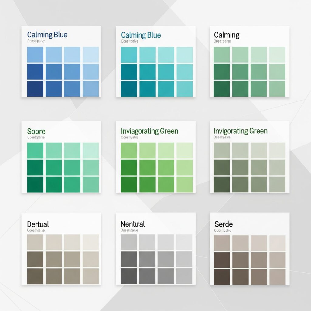
🌟 Top Color Themes for Boosting Productivity
Let’s look at the best color palettes you can use based on psychology and productivity science:
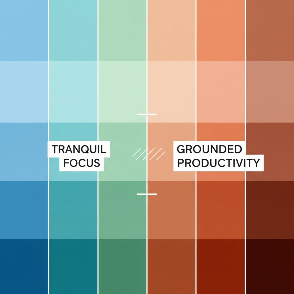
✅ 1. Blue & White — Calm Focus Theme 💙🤍
This is one of the most recommended themes for work and study.
- 💡 Why it works: Blue promotes calm and focus, while white keeps the space feeling open and clean.
- ✅ Best for: Writing, planning, studying.
Use in apps, wallpapers, or website themes for a peaceful, sharp workspace.
✅ 2. Green & Cream — Natural Balance 🌿🤍
Green symbolizes growth, nature, and mental balance.
- 💡 Why it works: Helps with long hours of screen time, gives your eyes a break.
- ✅ Best for: Reading, reflecting, brainstorming.
Add a soft green accent to your dashboard or use cream paper-style backgrounds.
✅ 3. Yellow & Grey — Optimistic Energy 💛🩶
Yellow brings positivity, and grey gives it balance.
- 💡 Why it works: The yellow adds light energy, while grey keeps it grounded.
- ✅ Best for: Creative work, idea generation, designing.
Use soft yellow highlights or widgets with grey backgrounds to stay cheerful without distraction.
✅ 4. Purple & White — Mindful Creativity 💜🤍
Purple brings imagination and a sense of uniqueness.
- 💡 Why it works: Inspires creative thoughts while white keeps it clean.
- ✅ Best for: Artistic projects, writing, content creation.
Try a pastel purple header with white panels for a dreamy-yet-clear setup.
✅ 5. Soft Beige & Earth Tones — Minimalist Zen 🤎🤍
Simple, soft tones that make your space feel cozy and calm.
- 💡 Why it works: Reduces stress, clears visual clutter, and feels warm.
- ✅ Best for: Digital detox, journaling, goal setting.
Ideal for minimalist dashboards or habit trackers.
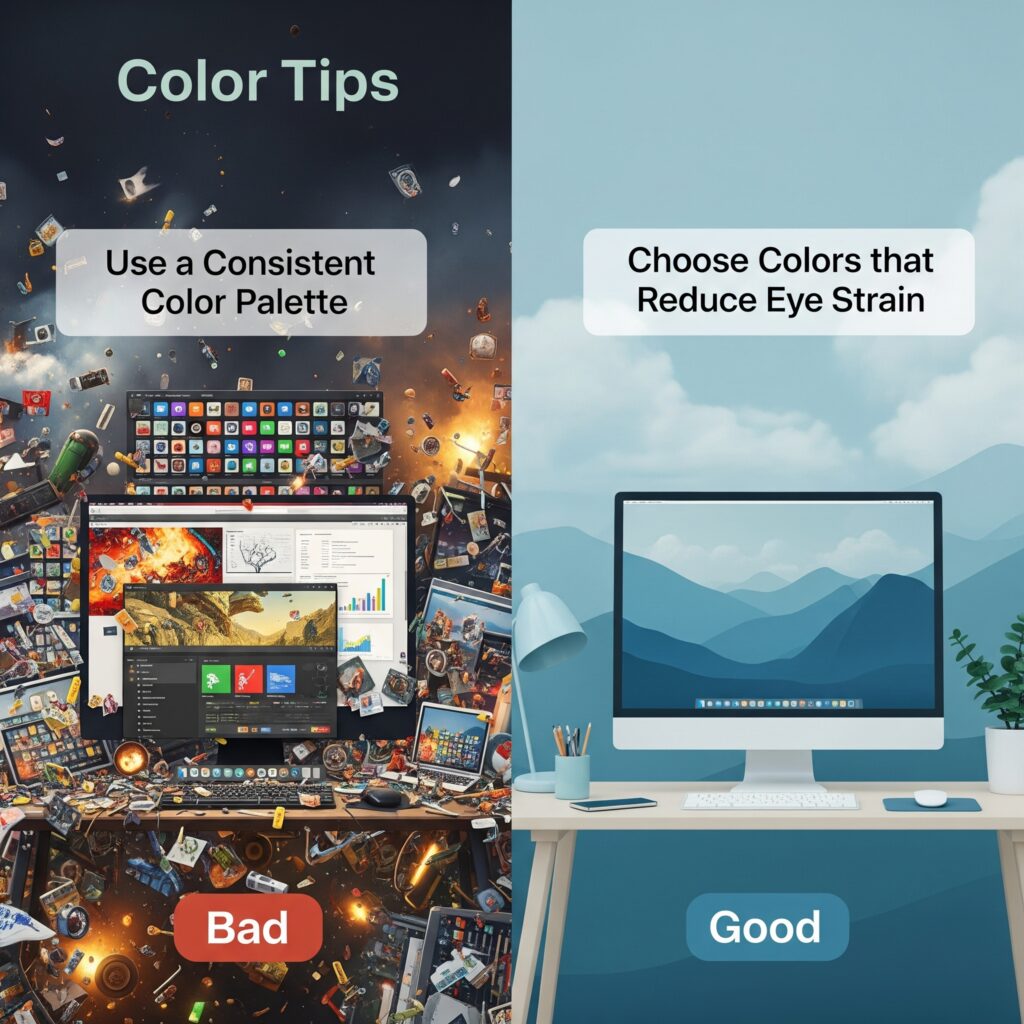
🌟 Bonus: Color Tips for Digital Setups
- 🖥️ Use dark mode at night to reduce eye strain
- 💻 Add a highlight color (like blue or green) to buttons and links for better focus
- 🎯 Use one main color and one accent color to keep things visually clean
- 💡 Add a motivating quote in a bright color on your home screen!
🌟 Final Thoughts
Your color theme isn’t just about making things pretty—it’s about creating an environment where you can feel better, think clearly, and work smarter. 🧠💡
So whether you like calm blues, bright yellows, or creative purples, pick a theme that feels like you and makes your productivity shine. 🌈💼
With tools like AIDailyDash, you can customize your workspace to match your focus style—and let colors guide your flow. 🎨🚀